 Update: I have shut down FindRoomRent.COM, and domain is available through Godaddy. The project did not spin off due to numerous factors. This article is kept here to illustrate the idea and implementation.
Dealing with people is always hard – different characters, likes, lifestyles and a ton of other variables. It gets more interesting when you are trying to find a roommate. There are of course no ideal ones. But while you search you get to meet a lot of interesting individuals. And hopefully you won’t get scammed, or even robbed as some shady people like to “preview” places before they break in…
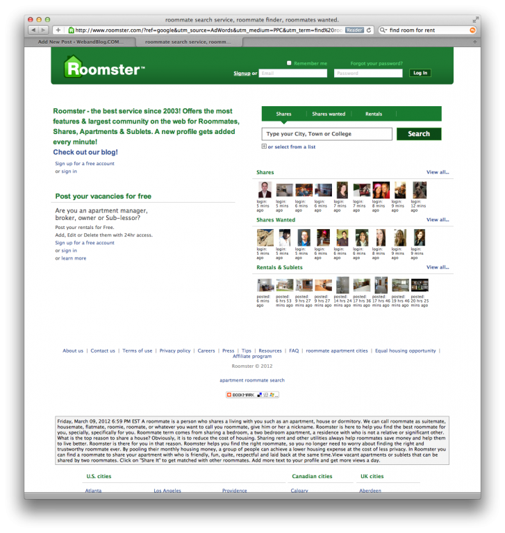
Craigslist comes handy, but they warn you every step of the way about possible fraud…there are as well a few other sites, but hey, what an ugly 90s design they have:
It’s just an information overload. And colors, font sizes and layout… can’t compare to anything but sites built with MS Frontpage 98.
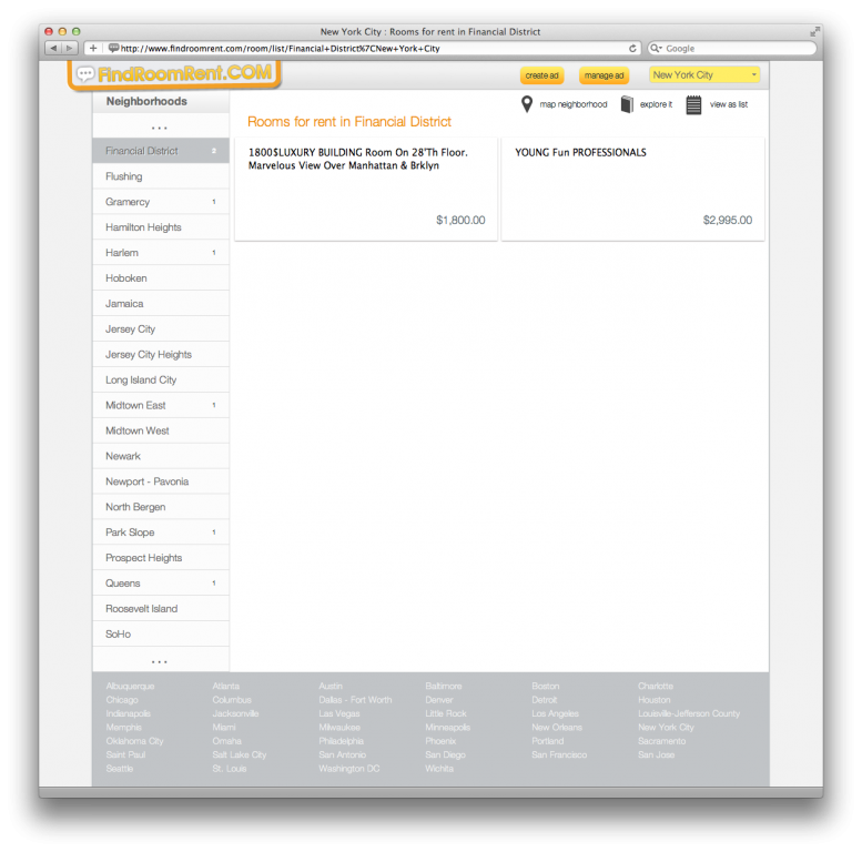
Thus, I have decided to create something easy to navigate, with modern UI and attempted to structure information for neighborhoods, as people most likely will tend to look for places based on the neighborhood preference. To limit scam and fraud, everything was linked to the cell phone number.
Want to post? Verify your phone number and go ahead. Respond? Same thing. Looking to receive notification for new posts on your cellphone? Subscribe and get them right away!
This had definitely cut off people from outside of the country, as site is limited to US cell phone numbers only. As well as people with no cellphones. But why would I care about someone browsing web on a dial up connection and Internet Explorer 6? Use Yellow Pages, or Jewish Yellow Pages, or don’t.
So after two months of coding and designing FindRoomRent.COM came to live:
FindRoomRent.COM - neighborhood view
Look at how fluid and easy the process of listing is. How great ad looks on the page… I think I nailed this one, but there is always room to grow and site will see some more changes and improvements in the near future.


1 Comment
Looks great. I’d love to see the analytics for the site – you should post them up in, say, a months time!